Brand and Campaign VisID
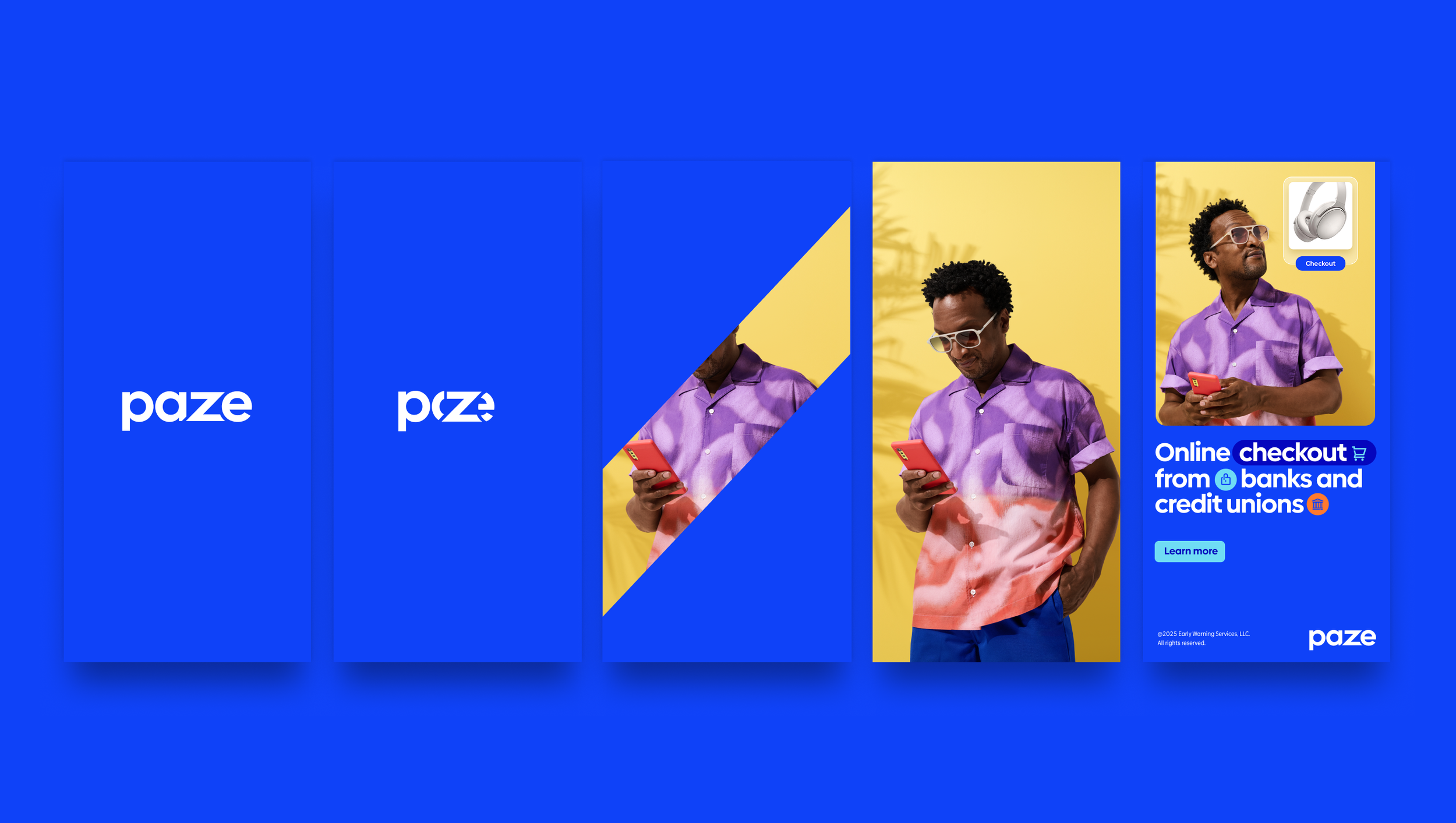
Paze
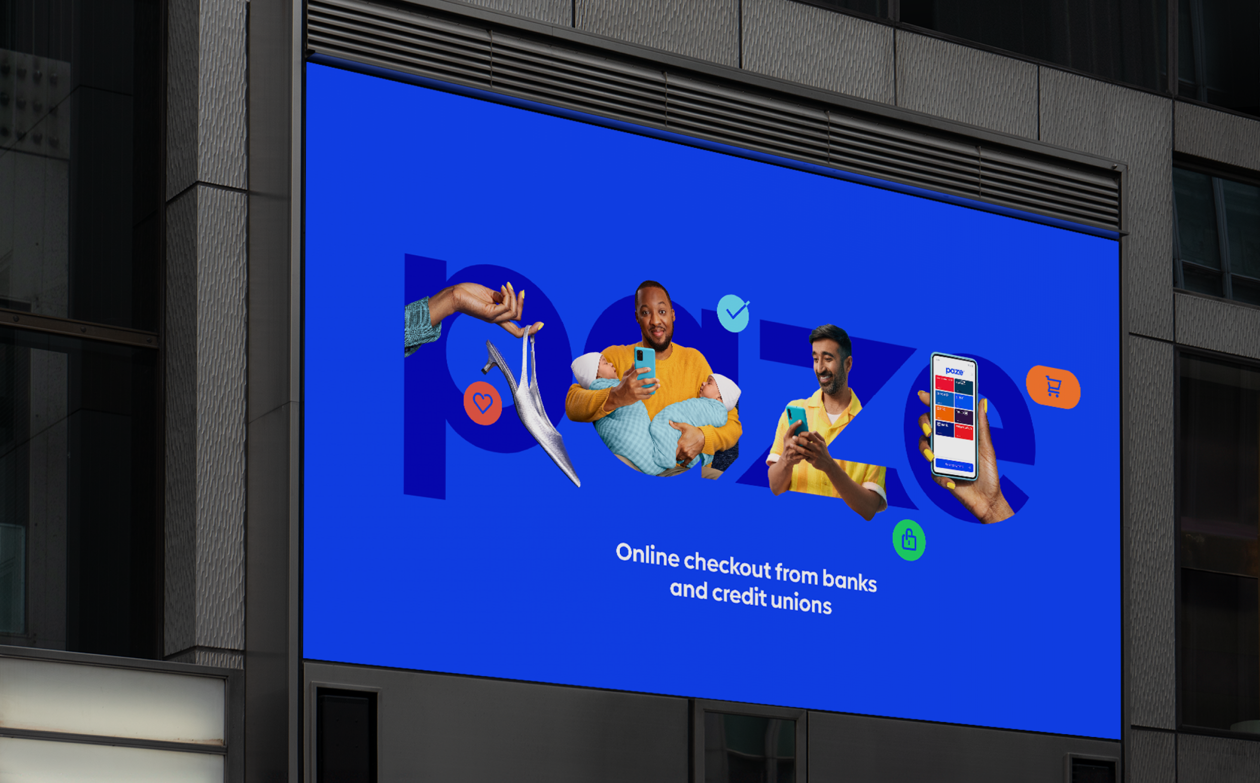
Online checkout offered by banks and credit unions

Paze is the new online express checkout solution from Early Warning Systems, the creators of Zelle. Backed by eight major U.S. banks, Paze delivers the same convenience as Google Pay, PayPal, and Apple Pay—with the added security and trust of traditional banking.
As a true startup, the challenge was twofold: build a compelling brand and clarify exactly what Paze is. Our strategy centered on relatable human stories that showcase Paze's convenience—"online checkout built for how you shop."
Equally important was defining what Paze is not: not a credit card, not for in-store payments, not another app to download. We developed a distinctive visual language using e-commerce iconography, UI elements, and playful animations that immediately communicate Paze's digital-first, checkout-focused purpose across all applications.
In collaboration with Lippincott and Linotype a custom typeface was created featuring a unique lowercase “z”. Letterforms and their terminals were designed with a 45-degree angle, mirroring the “z” within the Paze logo.
The Paze logo (designed by Lippincott) is brought to life through the angular “z”. Bringing forth notions of approachability, action and ease of use.
The rich color palette provides vibrancy and energy to the Paze brand while complimenting the diversity color utilized within partnering banks, credit unions and online merchants.
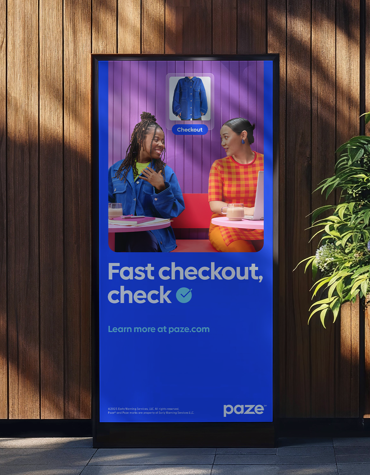
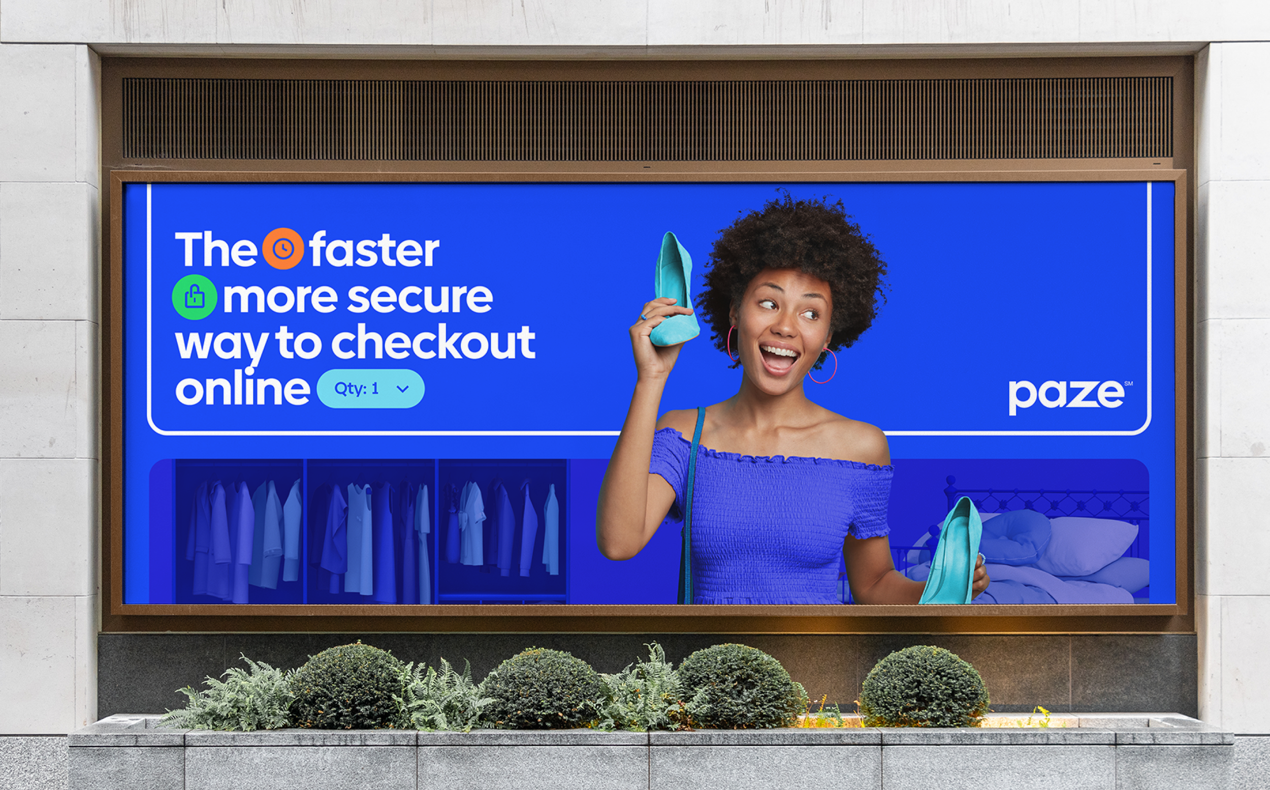
Iconography focuses on the visual language of e-commerce UI. Simplified for versatility and demonstrating key moments within the checkout experience. The system combines rounded corners with sharp edges and open gaps.
A simplified experience
Streamlining UI examples through a marketing lens helped to highlight key moments within the checkout experience. This ensured that unique selling points and reasons to believe were communicated with a sense of ease, simplicity and clarity.


Paze is built for how you want/ need to shop-with less hassle and more confidence. Worlds were built that online shoppers can authentically see themselves in, all-the-while remaining open to imagination and possibilities.
Hands with devices and holding objects of desire introduce a more human touch to hard working Paze UI demonstrations and online purchase examples.
Stylized tabletop photography helped to tell stories around specific types of merchant opportunities and online shopping activities.
Over-the-shoulder moments helped to demonstrate real-life, situational shopping. This also provides context for how Paze is used and relaxed, stress free, online checkout.


Ready for launch
Younger generations are bound to adopt new technologies faster than others. To introduce Paze to the world and reach millennial shoppers who may be less likely to change old habits, a series of vignettes were captured with whimsical, relatable scenarios that they could see themselves in.
My role & contribution
From the initial client pitch, to the launch of Paze and beyond – my role within the team was focused around establishing the foundational design thinking and approach for the both the brand and individual creative campaigns. This took various forms of collaborating with client stakeholders, the design team at Paze, partnering with other agencies, and empowering my own internal team to create with guidance and clarity.
Design
Cory Galster - GDD
Cole Spiess - ADD
Harry Garcia - EDD
Sydney Tomer - Designer
Anna Kim - Designer
Creative
Mike Lee - GCD
Bradford Gilmore - CD
Ingrid Wu - Art
Lauren Jones - Copy
Production
Kristopher Kowel - VP, Production
Jessi Aylward - Exec. Producer
Erika Tribble - Sr. Producer
Account
Jordan Middendorf - VP, Account
Kevin Romero - Account Supper
Brand Strategy
Alessandra Pinho - VP, Strat
Ben Trinh - Strategy